In-depth field user research was conducted in Dubai with a leading investment group to understand the needs of retail store owners and users, aiming to shape an integrated eCommerce and Fintech platform.
Role
Industry
Duration

My Role & Project Overview
I led UX efforts to modernize the POS experience for shopkeepers and customers, collaborating with cross-functional teams. Through qualitative research with 10+ shopkeepers and consumers across markets, we uncovered behavioral insights that shaped user-centric solutions and helped meet business goals within a 6-month timeline.
Challenges
The market is dominated by mom-and-pop stores, often averse to new technology and driven by personal passion. With limited space, outdated accounting, and fragmented supply chains, they prioritize customer satisfaction over experience—yet current tech fails to bridge the gap or support modern, seamless interactions.
Persona, Journey Map & Recommendations
Persona: The personas helped uncover the daily challenges faced by both shopkeepers and customers, including buying behaviors, peak footfall times during the day and evening, and the specific changes each group is willing—or resistant—to adopt.
Journey Maps: This exercise, validated by both user segments, clearly highlighted key opportunities to enhance the overall experience while aligning with organizational goals. Both the current (as-is) and future (to-be) journey maps played a crucial role in guiding the research and shaping strategic design decisions.
Insights & Recommendations: After extensive research, we shared key insights and recommendations in a client workshop, leading to swift adoption. Suggestions included shifting from paper to app-based tab management, consolidating vendors via a single aggregator, enhancing home delivery through an app, moving to vendor-managed inventory, and introducing QR code payments to speed up billing.


Wireframes - Hand-drawn sketches
An overview of the hand-drawn sketches presented during the Design Thinking workshop.
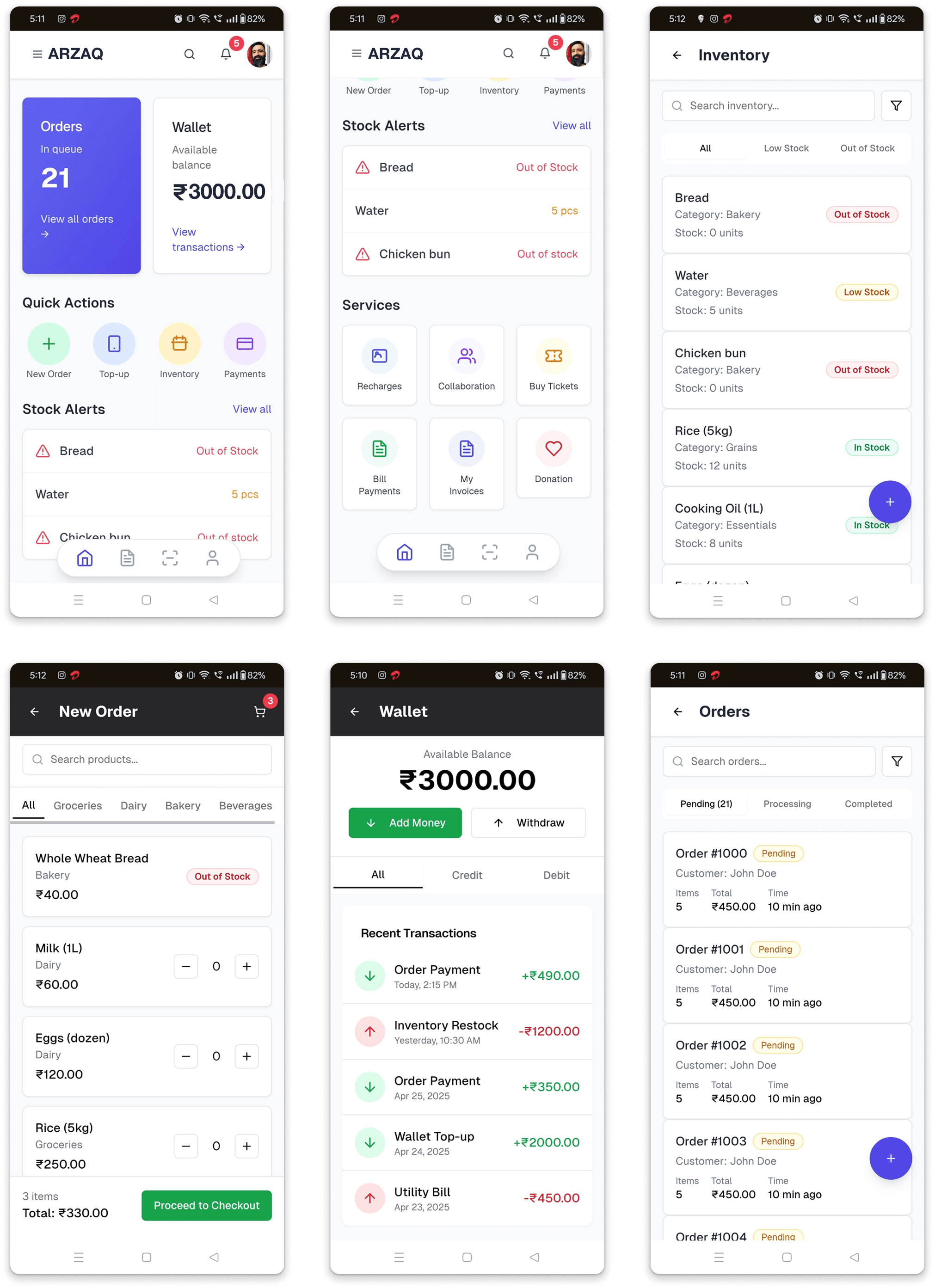
High Fidelity UI Screens
A few key high-fidelity UI screens effectively convey the visual language that has been followed.

Final Outcome & Thoughts
Check-out time cut by 3 mins
Visual ads drove 15% more sales
Digital Khata reduced stress.
Beyond tech, the 6-month journey bridged gaps between assumptions and real user needs, aligning the organization with its users through research and design.